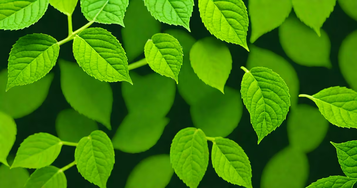
The color green is a hue derived from the visible spectrum between blue and yellow, typically associated with plants, nature, and renewal. It appears in wavelengths from approximately 495 to 570 nanometers and is perceived by the human eye through cone cells sensitive to medium wavelengths.
Green results from the combination of blue and yellow light in additive systems like screens, or from pigments that absorb red and blue light while reflecting green. It is one of the primary colors in the RYB model used in traditional art and design, though modern color science uses RGB and CMYK models.
Humans perceive green most due to evolutionary adaptation-early primates developed color vision to distinguish edible leaves from toxic ones. This biological basis explains why green remains a dominant color in visual environments, especially in natural settings.
Green activates the M-cones in the retina, which respond to medium-wavelength light. The brain interprets this input as green, often linked to calmness and balance. Studies show that exposure to green environments reduces stress markers like cortisol and improves attention recovery.
In design, green signals safety, health, and sustainability. Traffic lights use green to indicate "go" because it stands out against common urban backgrounds and is easily distinguishable from red and yellow. Digital interfaces use green for success states-like checkmarks or confirmation messages-because it conveys approval without alarm.
A 2021 study published in *Frontiers in Psychology* found that participants working in green-lit rooms reported higher focus and lower fatigue compared to those in white- or blue-lit spaces. The effect was strongest during prolonged tasks, suggesting green supports sustained mental effort.
Green spans many hues, from pale lime to deep forest. Different shades carry distinct associations and applications:
| Shade | Hex Code | Common Use | Psychological Effect |
|---|---|---|---|
| Emerald | #50C878 | Luxury branding, high-end products | Tranquility, elegance |
| Forest Green | #228B22 | Nature-themed design, eco-products | Stability, groundedness |
| Chartreuse | #ADFF2F | High-contrast graphics, retro styles | Energy, boldness |
| Seafoam | #93E9A0 | Interior design, soft palettes | Lightness, freshness |
Emerald green, for example, is used by brands like Tiffany & Co. in packaging and advertising to evoke luxury and timelessness. Chartreuse, while less common, appears in protest art and punk fashion due to its high visibility and rebellious tone.
Contrary to popular belief, not all green shades are calming. Bright greens like neon chartreuse can increase heart rate and stimulate alertness-making them effective for warning signs or attention-grabbing ads.
Green dominates in environmental and wellness contexts. The World Health Organization notes that access to green spaces correlates with reduced rates of depression and anxiety. Urban planners incorporate green roofs and parks to mitigate heat island effects in cities.
Brands use green to signal ethical practices. A 2020 report by NielsenIQ found that 66% of consumers were willing to pay more for sustainable products, and green packaging was a key factor in purchase decisions. Companies like Patagonia and Seventh Generation use green prominently in logos and materials to reinforce their environmental missions.
Green also plays a role in psychology and therapy. Color therapists use green in meditation spaces to promote emotional balance. In clinical settings, green walls have been shown to reduce patient anxiety during long waits, according to research from the University of Exeter.
Many assume green is universally soothing. However, cultural context alters perception. In some East Asian traditions, green symbolizes envy or misfortune. In China, green is associated with youth and vitality, but not always positivity-used in idioms like "green eyes" to describe jealousy.
Another misconception is that green equals "natural." While many natural elements are green, synthetic dyes and artificial foods use green coloring to mimic nature. The FDA requires labeling of artificial colors like FD&C Green No. 3, which is used in candies and beverages despite being chemically unrelated to chlorophyll.
Green is also frequently confused with blue in digital displays. On low-resolution screens, certain greens can appear bluish due to pixel blending. Testers at the National Institute of Standards and Technology (NIST) found that 12% of users misidentified specific green shades as blue under ambient lighting conditions.
Consider a pair of dark green pants worn with a white shirt and brown shoes. Dark green, specifically a shade like #004d40 (a deep forest green), offers a sophisticated base. The contrast with white enhances visibility and creates a balanced look.
I once wore a forest green sweater to a job interview. The hiring manager later mentioned it helped create a sense of trust-"you looked calm and intentional." That moment confirmed how deeply color influences perception, even when unspoken.
The color green is more than a shade-it's a signal, a symbol, and a tool. Its presence in nature, design, and psychology reflects both biology and culture. Understanding its nuances helps make better choices in everything from branding to personal style.